
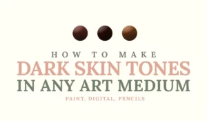
Do you need a skin colour for your colored pencil project, but don’t have one? In this article I’ll show you how to get a skin tone color from 3 colored pencils: blue yellow and red (or cyan, yellow and magenta to be exact!)
Here’s a Youtube video that shows you how to do it:
This article contains affiliate links which means when you purchase something through that link I earn a small commission at no extra cost to you ♡
NOTE: I’ve received some nasty comments saying I’m excluding dark skin tones. If you read the article you can see that the specific colored pencils used here are too light to create dark tones. Use darker primaries if you want darker tones or read here how to create any shade of skin tone you want.
Also, if you want to spice up your color theory, this full guide will help you out :)
What are colors made out of?
Before we start making our skin tone, we must ask ourselves what a colour exists out of. Colours are made out of 3 components:
– Hue
– Value
– Saturation
If you’re not caught up on the difference between hue value and saturation I’d suggest reading this simple article that explains hues values and saturation + 2 downloadable freebies!
Anyway, with these three components in mind, we can create any colour! So what about skin colour?
Different skin colours
First, let’s identify the hue of skin color. We’ll take a fair caucasian as an example. If you had to name skin color, what would it be?
I’d say orange or red. So I’ll go for a reddish-orange. But a plain reddish-orange looks far too saturated to be a skin colour. So we need to desaturate it. We can desaturate a colour by adding grey, or the opposite colour on the colour wheel. The opposite of orange is blue. Lastly we need to adjust the value. The value of caucasian colour is pretty light. We adjust value by adding white or black. In this case we need to add white.


Now for darker skin colours we obviously need to adjust our value. We need to add black. But we also need to saturate the colour in order to keep the skin looking ”alive”. If we do not increase the saturation with darker skin colours the skin often looks too dull and lifeless.
As a rule of thumb: the darker the skin colour, the more saturated it has to be.


Picking our primaries
You might still remember from elementary school that primaries make up the rest of the colours. Red yellow and blue can make green violet and orange. But Instead of the ”ordinary” red yellow and blue, I’m choosing Magenta, yellow and cyan. I’m using my beloved Prismacolor Premier pencils for this project.
Blue Yellow Red VS Cyan Yellow Magenta
Magenta, yellow and cyan are very similar to red, yellow and blue. The main reason I’m going for MYC is because they are lighter in value. Meaning it’s a lot easier for them to create vibrant light colours, whereas if you would use regular RYB it would be harder to achieve that. The outcome of these colours would result in darker values. You could add white, but you’d have to add a lot. Pencils are already a slow medium to work with so this would only add to the time.

Warm VS cool colours
There’s another difference between BYR and CYM. BYR lean toward warm colours and CYM lean toward cool colours. How do we know this? Have a look at the colour wheel:


Note: Yellow has the same hue here. In theory BYR yellow leans more towards the red and the CYM yellow towards the blue. The slivers I made should be moved a tad to the sides!
| Warm colours | Cool colours |
| Red | Green |
| Orange | Blue |
| Yellow | Violet |
If you compare CYM with BYR colours you can guestimate where each colour sits on the colour wheel. Compared to Blue, Cyan leans more towards the greens which is a cool colour. The other way around: Compared to cyan, the blue we use in BYR leans more to the red. Magenta leans more towards violet and the yellow from CYM leans more towards the green rather than orange, which the yellow in BYR does. I’ll go more in-depth in an upcoming article.
It’s important to remember colours are all relative. Compared to different colours each colour could be warm or cold.
Click here to download the swatch template used in this article and video!
How to get skin tone colour from 3 coloured pencils
We start with swatching our colours so we know what we’re working with. Next, we’ll try 3 techniques. The first one (we’ll use the middle circle for this, so we can compare easier) we’ll use the 3 pencils only. Let’s do it!
Middle circle: 3 coloured pencils only
We learnt we need orange. So let’s start by colouring a layer of magenta. Next, we lay down a layer of yellow. Do you feel like the orange is too light? Use another layer of orange. Next, we’ll add a layer of blue to desaturate that orange. Start light so you don’t overdo it.
Now repeat everything! Orange > blue. Now that we’ve been layering the colours you might notice that the value is going darker. Not a problem if you’re going for this, but if you want to stick to a lighter skin colour you’ll need to stop in time. The disadvantage is that the fewer layers of pencil you have, the less smooth it will look. We’ll go over the options on how to smooth it out later on. let’s move on to the next circle.

Left circle: less layers to achieve lighter value
We’ll now start with the left circle. We noticed in our previous circle that the more layers you add, the darker the value will be. Now let’s try using fewer layers and let’s see what that’ll give us. The whites of the paper peeking through helps us to keep the value light. But this results in an even less smooth colour than the circle before! Let’s save this issue for later.

Right circle: 3 coloured pencils + white pencil
Now let’s start by starting our third (right) circle. We’ll use the exact same layers as the circle in the middle, but this time in between every couple of layers we’ll use a white. Once we get all of our layers down we’ll burnish with the white. Burnishing means pressing down hard with a pencil so we can mix the underneath layers. This gives us the look that we want!
Now, what about the other two circles? How can we make them look smooth? We can either use a solvent or use a colourless blender.

Achieving a smooth blend
Alcohol
Let’s start by using alcohol to smooth it out. I put alcohol in a refillable water brush for easy handling. Now, I’m doing this experiment on printer paper. If you use proper drawing paper you’ll see that it smooths out a bit easier. The change is not significant, but if you look closely something changed. This technique works best with heavy layers of pencil.

Colourless blender
Next, we can try and use a colourless blender. The blender will blend and slightly move the colours very well. In this case, it works better than alcohol. The circles appear to get darker and that is because there’s barely any white showing up. the entire area is now covered.

In conclusion:
In my opinion, the method for creating skin tone colours with coloured pencils works best with a white pencil (for fair skin). For medium darker skin, I would use a colourless blender. For very dark skin I would use alcohol or no smoother at all. It’s definitely not impossible to create skin colours with primary pencils, however, it is very time-consuming. However, the subtleness of each colour peeking through gives a beautiful look to your drawing. But unless it’s your only option I would buy a set of skin tones!

So there you have it! I hope you enjoyed this tutorial :) If you have any questions you can leave them down below.
♡ Laura
