When creating a painting you often have an idea of which colors to use: greens for foliage, blues for water, reds for flowers etc. But how do you know how to pick the right hues, tones, tints, and shades for your color palette? And how do you pick the correct base colors so you don’t wind up using 10 tubes of paint?
The easiest way to create a color palette for a painting is to map out a mask over a tonal color wheel. You do this by picking 3 to 4 colors that you connect. This results in a triangular or square shape. Any colors that sit within that shape are the colors you use in your painting, resulting in a cohesive look.
Let’s find out how to put together a (limited) paint palette that ensures you have full control over your colors!
Simple color theory to create color palettes
To create a color palette it’s best to know the basics of color theory. I always say: color theory is simple but complicated. The rules are easy to follow, but sometimes you need to think of all of those rules at the same time which could get a little confusing.
Here are some terms you need to know before we start talking about how to create a paint palette:
| Term | Definition |
|---|---|
| Hue | The name of a color (Red, Blue, Yellow, Green etc.) |
| Value (also known as lightness) | How dark or light a color is |
| Saturation (also known as chroma or brightness) | How gray a color is |
| Tints | Color + white |
| Shades | Color + black |
| Tones | Color + gray |
| Color gamut | A range of colors |
There are 2 main color wheels: the classic Red, Yellow and Blue color wheel which we learned about in elementary school, and the CMY color wheel (sometimes referred to as the YURMBY color wheel by James Gurney. More on him later.). The CMY color wheel uses Cyan, Magenta, and Yellow as its primaries. This results in more saturated (or brighter) secundary and tertiary colors.

When we mix paint it always comes out darker and less bright than the two paints we used to create this color. This is known as subtractive color theory: paint + paint = darker paint. This is the reason why some prefer to use a color wheel with the brightest colors: the CMY color wheel (but honestly, it’s up to you).
How to desaturate colors (how to mute colors)
The last important thing to know is how to desaturate a color. You desaturate a color by adding the opposite color on the color wheel.
So, if you want to desaturate a yellow, you should add blue according to the CMY color wheel. This results in an almost perfect gray.
But according to the RYB color wheel you should add purple to yellow. Whilst it is true the colors desaturate each other, the resulting color of yellow and purple (RYB wheel) is more saturated than if you would mix yellow and blue (CMY wheel).

What is a color palette?
A color palette is a visualization of color swatches that work harmoniously together. These color swatches are often used for projects that involve the use of combining colors, like interior design, graphic design, paintings, and much more.
A color palette exists out of 3-5 colors. The hues of these colors are often picked by using a color harmony.
| Color harmony | Which colors? |
|---|---|
| Complimentary color harmony | 2 colors opposite of each other |
| Split Complimentary color harmony | 3 colors: 1 color + 2 adjacent colors of its opposite color |
| Triadic color harmony | 3 evenly spaced colors on the color wheel |
| Tetradic color harmony | 4 colors: 2 sets of complimentaries |
| Analogous color harmony | Colors that are right next to each other on the color wheel |
| Monochromatic color harmony | 1 color + its saturation range (tones) |
Color harmonies are excellent for seeing which hues match each other. But it doesn’t give you information about the saturation and value. Value is determined by light, and is the most important thing to get right. It’s not an artistic choice, but rather a fundamental skill.
Saturation on the other hand is mostly an artistic choice. But, saturation is affected by light. If an object is placed in direct light the saturation will be at it’s highest. If that object is placed in the shadow the saturation will drop. But other than that it’s up to you!
Color palettes for paintings
Once you established your color palette you need to pick your primary colors. Primary colors are the colors that you use to create every other color.
Since you are working with a limited palette that most likely doesn’t feature every color in existence, you don’t need to use the usual red, yellow, and blue. Instead, you pick colors that create every color on your palette. More on how to do this later.
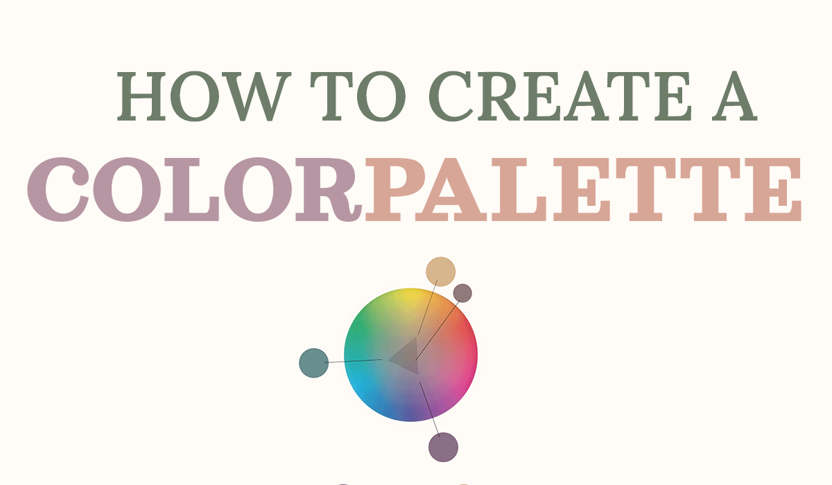
How to create a color palette for a painting
James Gurney is the artist that introduced us to gamut mapping for painters. With his method, you basically choose hues + their saturations and mark them on a tonal color wheel. Then you connect these marks which results in a shape. Every color that sits within that shape matches perfectly with your chosen primaries.
Gurney calls the colors that we chose as primaries the subjective primaries. Halfway the connected line of the subjective primaries lies the subjective secondaries.
Let’s find out the process of picking the correct colors for a painting!
Pick colors accordingly
To put together a color palette for a painting we need two things:
- A color wheel
- 3-4 colors as our subjective primaries
I always start my paintings with a story. My story for this particular painting is about a girl who ran away. She was found and is now being taken back to the castle where she came from. She’s not very happy since she wasn’t supposed to be found.
To enhance the story I’ll pick my colors carefully. According to color psychology, we can guide people’s emotions through color. Therefore I want my colors to be muted, cool and dark to convey sadness.
I want to have green in my palette since she’s surrounded by a forest. I’ll go for a blue-green. Next, I need colors that complement that green.
Use a color palette website (Adobe Color) to create a color palette
If you go to the Adobe Color website you can choose a color of your liking and then select a harmony. It automatically shows you which colors according to each harmony should be used.
According to a CMY color wheel, we see that blue-green, in a triad color harmony, matches with a yellowish-orange and magenta. Color harmonies are a helpful tool, but it doesn’t mean you have to stick to them. It’s merely a guide.
I think the magenta is too in your face, so I later make the decision to turn it into a violet (not to be confused with purple!).

Instead of using every single paint color that comes within a set of paints, you should create a limited color palette.
Advantages of using a limited color palette:
- Less paint tubes make painting on location easier
- Less paints means there’s less room for mistakes
- A limited color palette doesn’t overwhelm you as much as having to pick from 10 colors
- Mixing your own paints helps you understand each color
Gamut masking method
Since I now have established the hues, I need to decide on the proper saturation. This is why we use a tonal color wheel that only shows the tones (saturation) of each hue.

Since I want muted colors I pinpoint my colors near the center. Then, I connect them which results in a gamut. The gamut includes every color we can create with the primaries we choose.

Let’s not forget that the chroma wheel only covers hues and saturation. It doesn’t show value so keep in mind that each color within your gamut has an additional tonal range. If we, for example, add white to the color on the right mid-side of our gamut (below), we have a pink!

Creating pink from subjective primaries
So how do we create pink with these primaries? Pink is made by combining white and red. Out of our 3 primaries, purple is the only one that contains red.
Since purple exists out of blue and red, we need to cancel out the blue. According to the CMY color wheel, yellow cancels out blue. This means if we add our yellow/orange to our purple, it will result in a muted red (the blue turned into gray + red = grayish red). We now have the correct saturation and hue.
To get the right value, we need to lighten it by adding white. So, Purple + Yellow = muted red + white = muted pink
See.. the rules are simple, but combined together it gets tricky.
Since colors are relative you should wait before adding black to create darker values. Your primaries may be relatively dark enough. If not, you can always go back and darken areas.
And this is what my final painting looks like:

How to know which color paints to use for a color palette
Following James Gurney’s advice, you should mix your subjective primaries before you start painting. After that, you create your subjective secondaries. Next, you make strings, which are the tonal values of the hues. After that, you can work on your painting.
The advantage of this is that you are guaranteed to stay within your chosen gamut. The downside is that you can’t have bits of saturated areas that stand out. Which is fine, but sometimes you want that artistic freedom.
This is why I choose to work with tube paints which are the most saturated colors of my subjective primaries. You can always mute colors but you can’t make them any brighter. The downside is that it takes a bit more time to mix.
Below is an example of how I used saturated paint tubes to create my secondaries instead of starting with subjective primaries.

I used: Cyan mixed with viridian green, yellow ochre, and lilac. The bottom swatches are the same colors I used in my digital painting.
To sum up:
How to create a color palette for a painting:
- Pick 3 to 4 hues + their saturation
- Keep color psychology in mind
- Are you going for warm colors or cool colors?
- Pinpoint colors to a tonal color wheel
- Connect to see which colors lie within its gamut
- Pick the most saturated paint tube colors you’ve got or start by creating your subjective primaries
Intuitively picking colors to create a paint palette
Sometimes you don’t want to stick to natural colors. It’s just too much fun to pick whichever color you want, regardless if it’s realistic or not.
You can either grab your color wheel and pick from there, or find color inspiration on Pinterest. I’ve created a board dedicated to color palettes. I refer to it all the time!
Next, you pick 3 to 4 primaries and connect them. There’s your gamut! This is such a fun thing to do. So rather than get inspired by your sketch or subject, you let colors inspire you.
How to figure out any painting’s color palette
You find a painting’s color palette by identifying its 3 or 4 most saturated colors. Then, you pinpoint them on a tonal color wheel. After that, you connect the colors to create a mask. Every single color within this mask is the color palette of that painting.

Free chroma color wheel printables
I created 2 color wheels for you to download and print (or use them digitally).


Click on the image > click right mouse button > save as
Gamut masking method by James Gurney
If all of this theory confused you, the man himself created a clear video on how to gamut map. Enjoy!
Congrats on making it all the way down here! If you have any questions you can leave a comment down below or contact me on one of my socials. Happy painting!
♡ Laura


Excellent post! I’m really enthusiastic about color theory and this is one of the better introductions I’ve found on the subject online. Keep it up :)
Thank you very much! :)
Hello Laura. Your post really is excellent. I’m glad I found you after perusing the internet. It is clear and concise. Good examples to clarify the point. Thank you so much for helping me understand gamut masking and how to choose the colors for painting.
Have a wonderful holiday season!
I’m so glad my article was helpful to you :) Happy holidays!
Thanks for guide really helpful!